ERA BANK OC Quadrio
Client: ČSOB a.s.
Location: Prague, OC Quadrio, Czech Republic
Year of Completion: 2014
Award: ICONIC AWARDS 2015 – Winner: Interior Design Concpet For ERA Bank
Photo: Jonáš Mlejnek
We have created the architectural concept of the new branch network ERA FC, which will be applied by ČSOB throughout the Czech Republic in the next years. We created modern spacewith strong corporate ERA brand presence. A space whereyou feelcomfortable, relaxedand witha human feel. This spaceis designedin the spirit ofa significant difference fromthe typical bank interiors across thebankinginstitutions.
Part of the task was to create a flexible modularity, working with the furniture designed in a way that it could be applied in a variety of interior types. The investor also put great emphasis on unification and ease of construction.Therefore, the proposed concept uses four core elements of the interior.
Presented flagship in OC Šantovka, Olomouc was planned to be a showcase for a new brand concept ERA BANK, and this was considered in the design, compared to the second presented project ERA BANK OC Quadrio in Prague.
Creative concept is based on the presence of natural materials and organic forms derived from nature. Wooden columns and walls, woven flooring, organically shaped furniture elements of the space bring to the client atmosphere of no pressure, relaxation and inspiration.
Space isorganicallyshapedwith linearverticalwalls andcolumnsusingruled surface. These linesare made ofsmall woodenbalks/slats20x50mmandtheirdirection ofrotationindicates the dynamic of space.The endsof wooden slatsare cutby mainflowlineandcreate the illusionthat the entirearea is”cut and styled” or that the space iscovered in lacyribbontailored toclientneeds.Balk of 20x50mmwas the answer toour question howto solve, in relativelysimple andeconomicallyaccessible way,surfaceof wall coverings.
Bank branch is arranged in a way that the customer can move in the space completely independently. Lamellar wooden wall that divided the space creates a natural navigation and client is guided intuitively. We offer our customers five specialized zones, situated in the area of the branch in chronological order from the entrance.
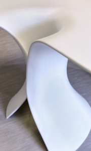
For this interior we designed original furniture which is mostly organically shaped and as material we used white Corian. We decided to apply white design to create a lightweight feel and achieve the illusion that the furniture is made from paper.
The interior uses wooden light ARBO that IO Studio designed for HALLA in 2013. Natural wood brings another warm element to the interior.


